MIDCENTURY INSPIRED KITCHEN, BATH & HOME REMODEL
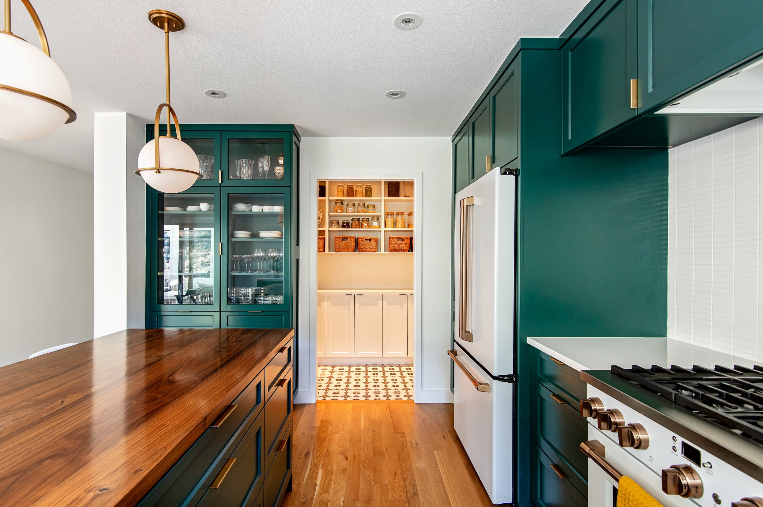
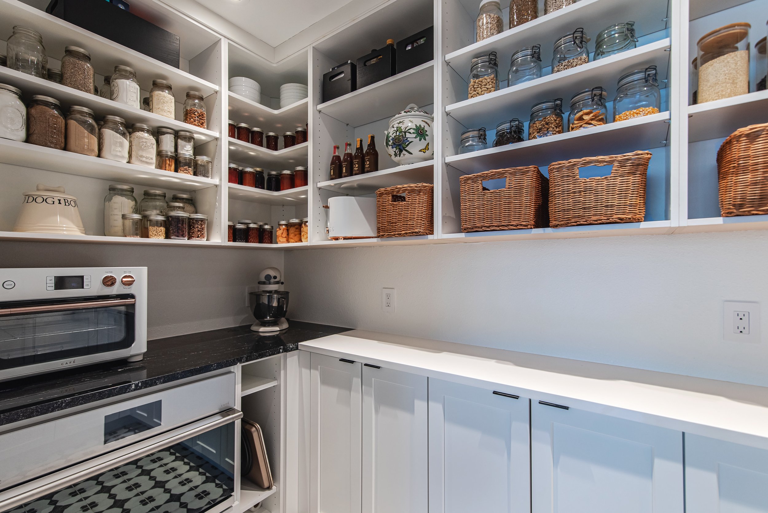
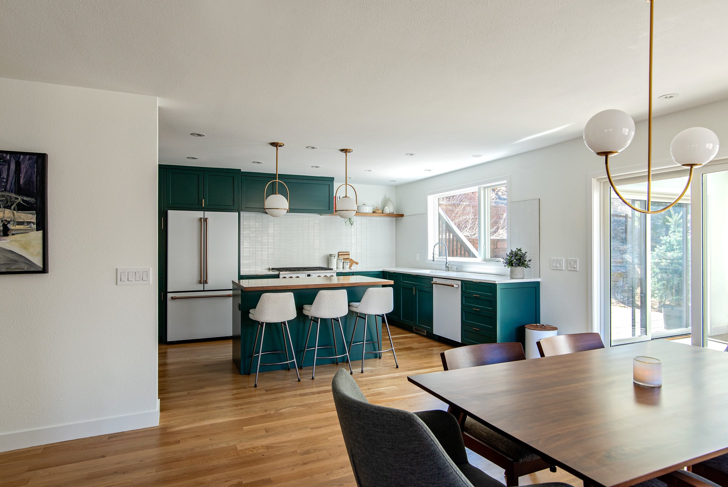
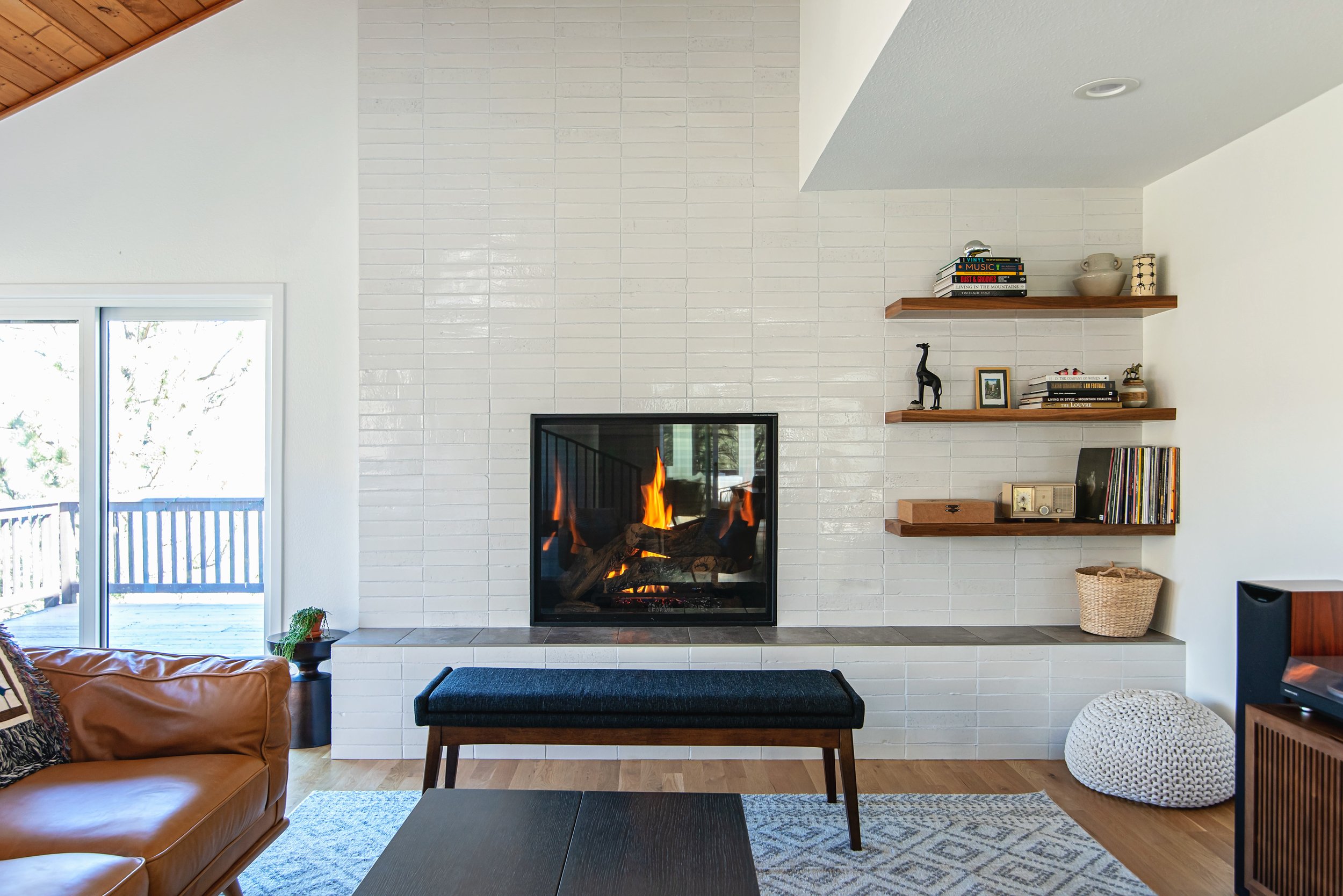
Located in the foothills but less than a 10-minute drive to the center of town, the home had the best of both worlds but was stuck in the 90's with poor layouts, unnecessary dropped ceilings, and super-dated finishes. The overarching goals were to capitalize on the great mountain views, achieve an easy flow on the main floor, create a fabulous kitchen for the couple that loves to bake and cook and have a spa-worthy bathroom that encourages exhaling and letting the stress melt away. A clean midcentury modern-influenced design kept the spaces tranquil and cohesive. The custom-colored kitchen cabinets ooze personality and go from an energetic blue-green during the day to a deep muted blue-green as the sun falls. A large wall in between the dining room and kitchen and the kitchen's dropped ceiling was removed extending the kitchen and adding a pantry fit with a coffee station, an additional oven, a marble remnant slab for pastry rolling, and loads of storage. Custom walnut island countertop and shelves in both the kitchen and living room and similar wall tiles in both rooms tie them together without duplicating the details exactly.
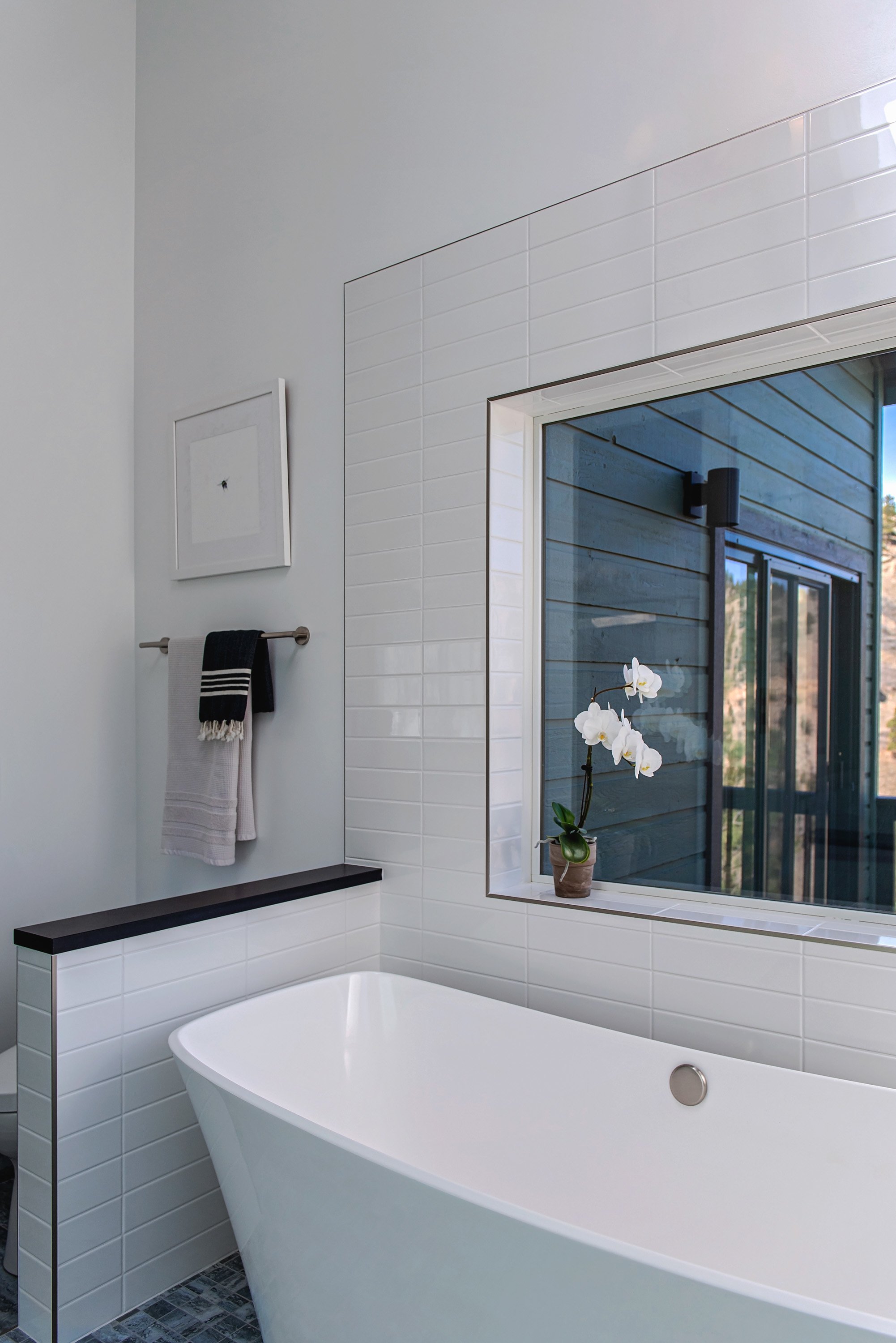
The primary bathroom was gutted transforming what was a drop-in non-functioning jetted tub with a ginormous deck area (large enough for your ten closest friends to lounge around) into a wet room with a roomy open shower and freestanding tub highlighted by the chandelier overhead. Only a small amount of obscured film on the windows was needed to provide enough privacy from the neighbors below while maintaining expansive views of the valley below. The toilet was removed from being the first thing you saw as you entered the bathroom and relocated to a less visible location while still getting views out through the wet room. The new bathroom layout utilizes the space much more efficiently yet feels much roomier than the original. So much so that about 72 square feet of the old bathroom was able to go towards increasing the size of the walk-in closet square footage and having an entry directly from the bathroom.
The dingy wall-to-wall carpet was replaced with wide plank white oak wood floors throughout the main floor with tile in its place at the entrance points. In an effort to keep what was working decently in the house and not make unnecessary changes, only the sliding doors were replaced while the windows and skylights, along with the living room's wood ceiling, were left intact. New lighting was added where none existed for better visibility and layering opportunities for creating different moods.

